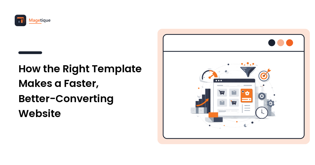
The template you choose is not a coat of paint you apply at the end. It is the foundation everything else sits on — how fast your pages load, how the store feels on a phone, how easily a visitor finds the checkout, and how many hours it takes to change anything later. Pick well and those things quietly work in your favor for years. Pick badly and you spend that same time fighting the template instead of growing the store. The takeaway up front: treat the template as an infrastructure decision, judge it on performance and code quality rather than the demo screenshots, and understand that a good one pays you back in speed, conversions, and saved development time.
This guide covers what the right template actually changes, the qualities that separate a quality template from a pretty one, and how the modern template stacks compare — the foundation layer beneath the broader store design that converts discipline.
Why the template decides more than looks
Every template ships with a set of decisions already made: how the page is structured, what loads and when, how much code runs before a shopper sees anything, and how the layout reflows on a small screen. You inherit all of it the moment you install. Those built-in decisions are hard to undo later, because the rest of your store gets built on top of them. That is why a template is less like choosing a paint color and more like choosing the frame of a house — the visible style is the easy part to change, and the structural choices are the ones you live with.
Two templates can look nearly identical in a demo and behave completely differently in production. One loads in a second on a mid-range phone; the other ships a pile of unused scripts and stalls for four. One has a clean, documented structure a developer can extend in an afternoon; the other is a tangle that turns every small change into a half-day of guesswork. The demo hides all of this. What you are really buying is the engineering underneath the screenshot.
Speed: the first thing a template gives or takes away
Speed is where template quality shows up most directly, and it is not a detail — it is a revenue lever. Shoppers abandon slow pages, and search engines rank them lower, so a heavy template costs you twice: fewer visitors arriving and fewer of them staying. The frustrating part is that most of the weight is decided before you add a single product. A bloated template loads oversized images, render-blocking scripts, and features you will never use, all on the first page a visitor sees.
A quality template is built to be light from the start. It loads only what the page needs, defers what can wait, and does not ship a framework's worth of JavaScript to render a product grid. You can feel the difference on a real phone on a real connection — which is exactly where you should test, not on a fast desktop that flatters everything. Speed you get from the template is speed you do not have to claw back later with caching tricks and optimization plugins, which is always the harder, more fragile path.
Responsiveness and UX: the same template on every screen
More than half of store traffic is on a phone, so "responsive" is not a feature to check off — it is the primary experience for most of your visitors. A quality template is designed mobile-first, meaning the small screen is the starting point rather than an afterthought squeezed in at the end. That shows up in tap targets big enough for a thumb, navigation that works without a mouse, a checkout that does not force pinching and zooming, and text that stays readable without effort.
Good templates also make good UX the default. Clear visual hierarchy, obvious calls to action, sensible spacing, and a layout that guides the eye toward the next step are baked into the design rather than something you have to impose. A weak template fights you here — you end up overriding its styles to achieve the basics, and every override is future maintenance. The right template hands you a strong starting point so your design effort goes into differentiation, not repair.
Conversions: how a template does the quiet persuading
Conversion is where speed, responsiveness, and UX compound. A fast page keeps the shopper who would have bounced. A clean mobile layout keeps the phone visitor moving toward checkout. A clear hierarchy puts the add-to-cart button where the eye already is. None of these are dramatic on their own, but together they are the difference between a store that converts the traffic it earns and one that leaks it. A template built by people who understand ecommerce encodes those decisions for you — trust signals with a place to live, product pages structured to reduce hesitation, a checkout that gets out of the way. You are inheriting someone else's conversion experience, so it is worth inheriting from someone who has one.
Development time: the cost you feel every month
The last thing the right template changes is how much every future change costs you. This is the hidden line item. Clean, well-organized, documented code means a developer can find what they need, make a change safely, and move on. Messy code means every task starts with an investigation, small changes break unrelated things, and the person who built it is the only one who can maintain it. Over a year of tweaks, promotions, and new sections, that difference dwarfs the price of the template itself.
What to look for before you commit
Judge a template against the qualities that survive contact with production, not the demo:
- Real performance. Test the live demo on a phone and run it through a page-speed tool. Look at what it loads before you trust how it looks.
- Clean, documented code. A structure a developer can read and extend, without a rewrite, is what keeps future changes cheap.
- Genuine responsiveness. Resize the demo and open it on an actual device. Check the checkout, the menu, and the product page — the places friction hides.
- Active maintenance and support. A template is software; it needs updates for security and compatibility. Check the update history and how questions get answered.
- A stack that fits your platform. Match the template to how you build. On Magento, that means understanding the frontend and theming options before you pick.
Modern template stacks, briefly
The template landscape has shifted toward speed by design. Older stacks tended to ship heavy JavaScript and render in the browser, which is exactly the weight that slows a store. Newer approaches lean the other way — sending mostly static HTML and adding interactivity only where it is actually needed, so pages arrive fast by default rather than after optimization. Tooling like Astro is built around that idea, and marketplaces such as modern Astro templates at Flux Theme reflect the move toward performance-first foundations. The principle matters more than any single tool: a template that starts light is a template you do not have to fix later.
FAQ
Does the template really affect how fast my store is?
Yes, more than almost anything else you control. The template decides what loads on the first page a visitor sees — images, scripts, fonts, unused features — before you add any content. A heavy template stalls on a phone no matter how good your hosting is, and clawing that speed back afterward with caching and optimization is harder and more fragile than starting light.
How do I judge a template's code quality without being a developer?
You can go a long way on proxies. Test the live demo on your phone and run it through a free page-speed tool — a bloated template shows up as a low score and a slow load. Check when it was last updated and how the maker answers support questions. If you have a developer, ask them to skim the structure; "can you extend this in an afternoon?" is the question that matters.
Is a good-looking template enough?
No. Two templates can look identical in the demo and behave completely differently in production — one fast and cleanly built, the other slow and tangled underneath. The screenshot shows the style, which is the easy part to change. What you are actually buying is the engineering beneath it, so judge performance, responsiveness, and code, not just the visuals.
What makes the newer template stacks faster?
They ship less to the browser. Older stacks often render pages with heavy JavaScript that the visitor's device has to run before anything appears. Newer approaches send mostly finished HTML and add interactivity only where it is needed, so the page arrives fast by default. The result is speed you get for free from the foundation instead of speed you have to engineer back in.
Choose the foundation, then build
The right template is the cheapest performance, UX, and conversion work you will ever do, because it is done before you start. It gives you a store that loads fast on a phone, guides shoppers toward checkout, and stays cheap to change as you grow. Judge candidates on real speed, clean code, genuine responsiveness, and active support — not the demo screenshots. Audit your current template against that checklist before you commit to another year on it, and if it fails, the foundation is the first thing worth replacing.